Back to Showcase
Mobile AppEducationEntertainment
Doomsday
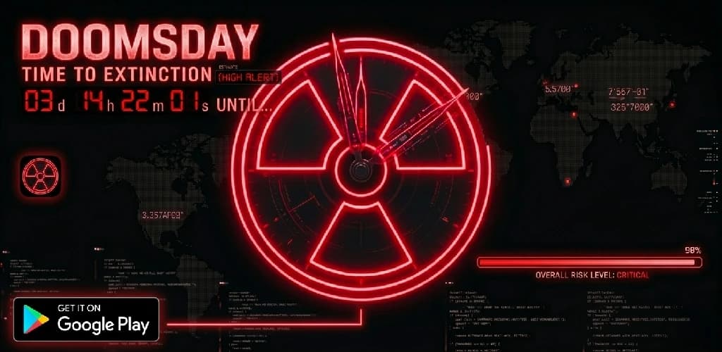
A command centre for the state of the world. Doomsday pulls together current global events and boils them down into a single, easy to read picture of how close we are to midnight.
- Released
- August 2024
- Platform
- Android
- Version
- 1.0.0
- Downloads
- 100+
Why Build It?
The news is relentless, fragmented and usually written to keep you scrolling. I wanted the opposite: one screen that gathers what is happening around the world and tells you, at a glance, whether things are getting better or worse.
How It Works
Doomsday collects information about current events and groups it into risk areas, then rolls those signals up into an overall reading. Rather than a wall of headlines you get a gauge, a handful of clear indicators, and the detail behind them when you want to dig deeper. The presentation leans into the drama of the subject, with a cinematic look that makes checking in feel less like homework and more like stepping into mission control.
Key Features
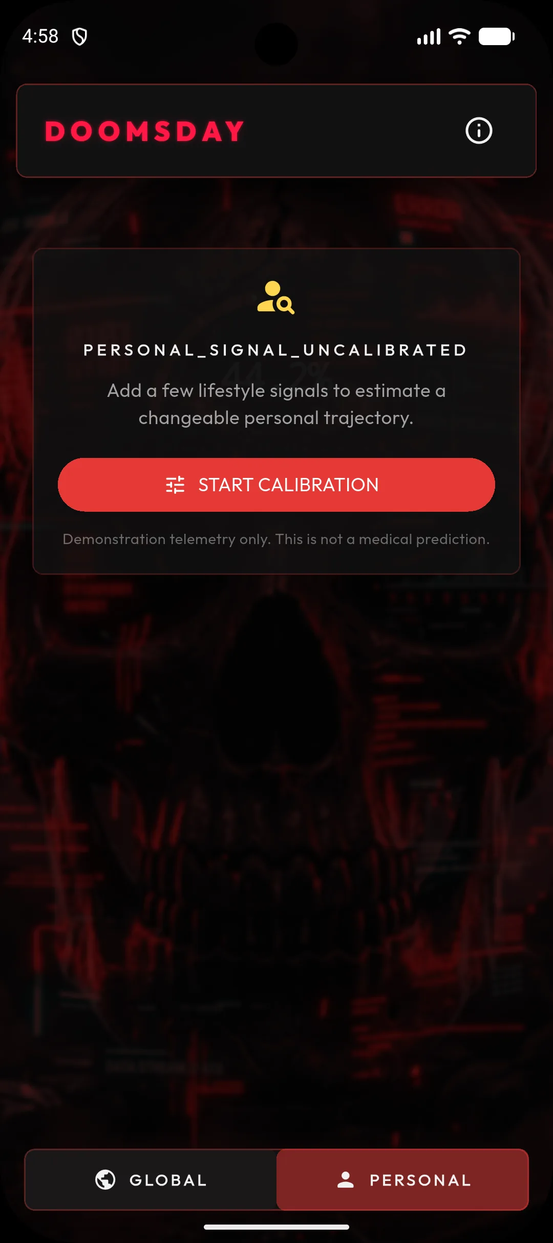
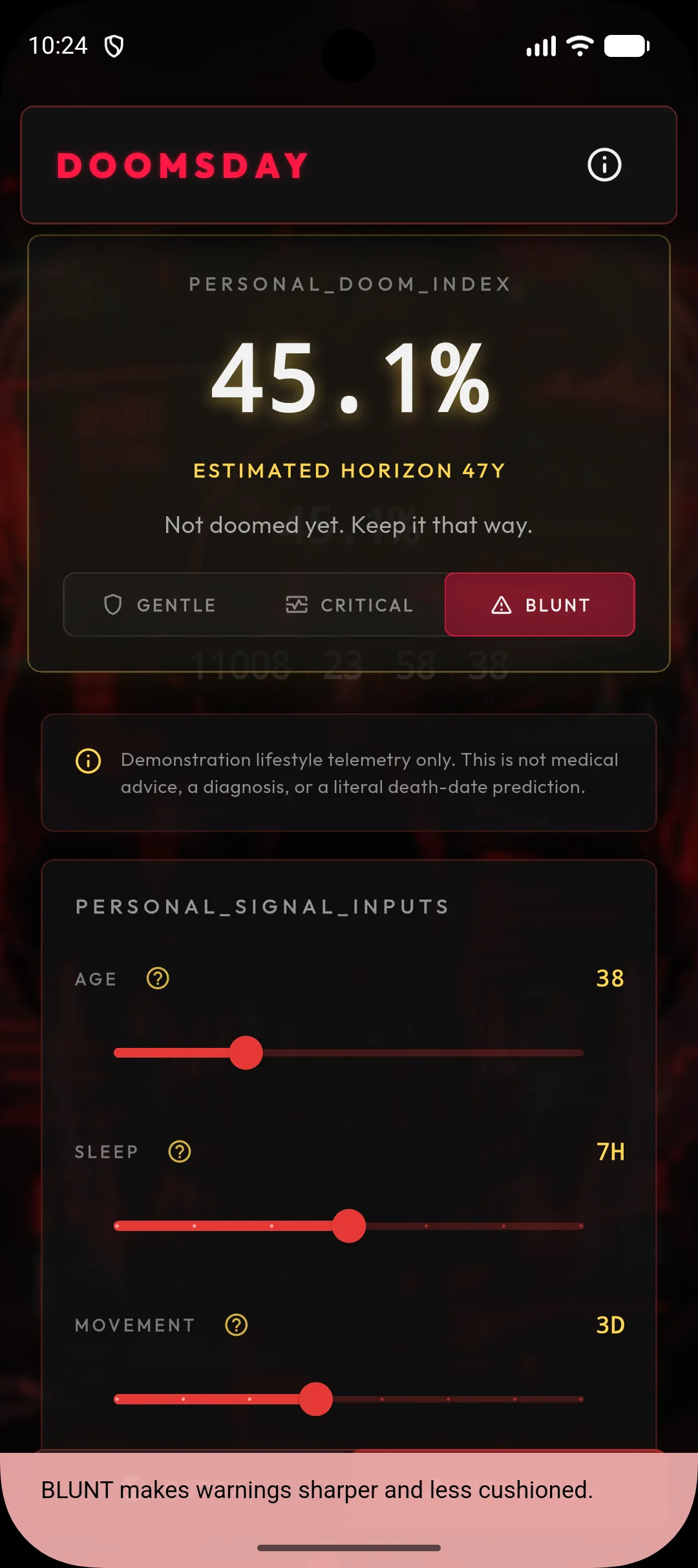
- Cinematic Command Center
A bold, dark interface styled like a mission control room, so the big picture is the first thing you see.
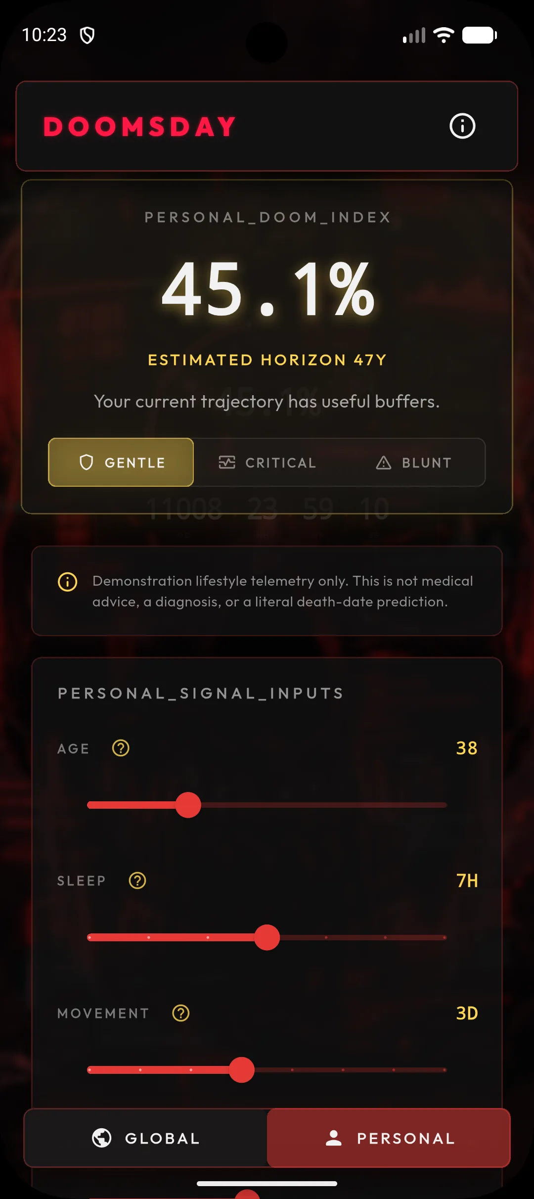
- Dynamic Doom Gauge
A single gauge that moves with world events, summing up the overall level of global risk in one glance.
- Global Risk Telemetry
The individual signals behind the gauge, broken down by area so you can see what is driving the reading.
Screenshots